Ever since its launch in the year 1990, Microsoft PowerPoint, which has been part of the Microsoft suite, has continued to grow from strength to strength. With each upgrade that is offered there comes more and more novel features for users to look forward to as well as make use of. So whether it is for classroom needs, business or corporate uses, Microsoft PowerPoint is still the preferred method for making presentations across the globe. Here are some tips for creating awesome powerpoint presentations.
 How to Make Awesome PowerPoint Presentations:
The following mentioned are few powerpoint presentation ideas and powerpoint tips on how to make a good powerpoint presentation.
1. It should be appealing to the eyes:
The chief function of making a professional PowerPoint presentation is to be able to get your point across in a clear comprehensive as well as concise manner. If you do not make your presentation appealing to the senses then what is the point of even making a PowerPoint? You could have simply read out your speech or shown some images via a projector. So if you are a teacher or a business man trying to bag a deal, then making a visually impactful and effective PowerPoint presentation will help you greatly.
2. Sound clips have a powerful impact:
In addition to appealing to the visual senses of the audience, Microsoft PowerPoint makes it possible for you to appeal to the audiences’ auditory senses as well. Microsoft allows its users to do practically whatever they want in order to make their presentations look top notch, so rather than stopping at the bare minimum by putting a picture or to with some words, you should try and take your presentation to the next level by putting in a relevant and unique sound clip or a video which you have managed to get your hands on.
3. More images fewer words:
A key to help you make amazing PowerPoint presentations is trying to incorporate as few words as possible, but placing as many images as you possibly can. Very often a power point is accompanied by a person speaking along side, so rather than having the individual reading from the presentation it would be more impactful if you use the space wisely with images. Needless to say, you know from experience that no one really reads the long paragraphs on presentations.
4. Font should be neither too big nor too small:
If you are putting titles and subtitles or captioning your images, then you should make it a point to choose appropriate fonts. Microsoft PowerPoint offers its users the chance to choose from a mind boggling array of fonts. But that does not imply that you get carried away. Using more than two or three kinds on a page looks terribly unprofessional as well as weird. So it would greatly beneficial you to keep in mind the audience of your presentation and take your decisions accordingly.
5. Movement attracts a lot of attention:
During a sultry day at school or a busy day at the office a sure shot way to attract the attention of your audience is movement. Movement on the presentation is something which is indeed very eye catching. Microsoft PowerPoint gives users the opportunity to have the words or the images coming in and leaving in various unique ways, so if your aim is to grab the attention of a not very interested audience, this is one way in which you can, but remember too much movement is something that is not desirable as well.
6. Select a nice and appropriate theme:
Rather than having a dull plain, white background for powerpoint presentation, what you can do is choose an apt one from one of the numerous themes offered by Microsoft PowerPoint. However if you find that none of these suit your purpose or if your aim is to do something completely novel as well as out of the box then you can make a theme of your own as per your individual wants as well as needs. Just remember that the more effort you put into your presentation the more eyeballs it will be able to grab.
7. Use the layouts provided to have better impact:
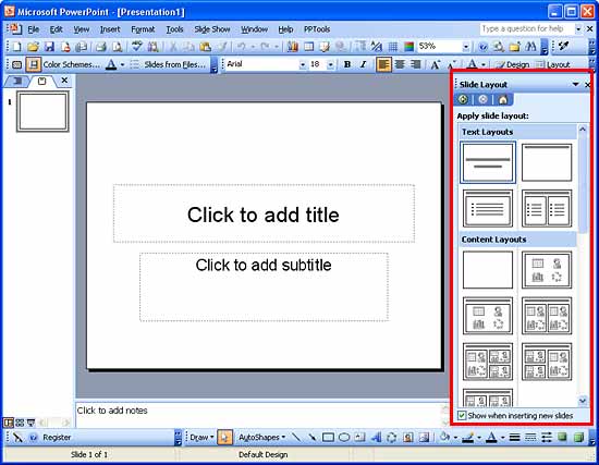
The powerpoint layout designs which have been offered for the benefits of the user can be made use of in order to create a need as well as professional looking PowerPoint presentation. There are number of layouts which are at your disposal. However here too if you find that there is nothing which suits your particular purpose then you have the freedom to create your own. In order to make each of your powerpoint slides look different from the next you can change the layout for each slide.
8. Do not overdo it – Less is more:
Out of the most important presentation tips that need to be kept in mind while making a interesting presentation is that just because there are so many options, features and layouts open before you on Microsoft PowerPoint, does not mean that you should get carried away. Often, especially in the business world less is more and in such cases exercising your restraint is very vital. No matter how much effort you are putting into your work if you are to go overboard then chances are that you will not get the credit which is due to you.
9. Make the presentation as per your individual requirements:
To a person using amazing PowerPoint for the first time or so, it might seem that Microsoft PowerPoint merely gives you options to choose from and select. However this is something which is not true at all. It is of paramount importance to know that you can also custom all the settings, layouts and themes according to your individual needs and requirements.
10. Make sure all images or words are properly aligned:
What many people might forget is that the presentations which you make are not only for you but are made to view before an entire audience via a projector. So in such case it is of paramount importance to make sure that all the work has been properly as well as perfectly done. Even the slightest of errors, when projected become easily visible to one and all. So make sure everything is aligned as well as positioned properly before giving your presentation to avoid such embarrassment at work.
11. Make use of the PowerPoint shapes which are offered:
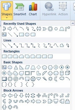
For every feature that it offers you, Microsoft offers you a mind boggling range to choose from as well. So if you want to place your text or an image within a box then it is not necessary that this box has to have a circular or a square shape. Microsoft PowerPoint is incredibly user friendly and allows you to spread your wings and use the software to do whatever you want it to, rather than being limited.
12. Crop the images in novel ways:
Microsoft PowerPoint now gives its users the chance to crop their images in different and unique ways. For example if you are making a presentation for your kindergarten students on why it is important to treat animals well, you can crop the pictures of the animals using different stencils offered like a heart or a star etc. Doing little things like this really do manage to go a long way in making your presentation much more appealing to the viewers who might be ranging between various ages.
14. Custom your slide sizes if you would like to:
Another great feature which not many people are aware of is the fact that you can alter the size of your slide without any trouble at all. To alter the size all that you need to do is Go to the option that says ‘File’, Then click on the option ‘Page Set Up’ Then once you do that, select the width as well as the height of the powerpoint background which you would like, then following this you have to click on ‘OK’. Many people make powerpoint presentations but great presentations need that extra care.
16. Practice makes perfect:
Initially you might find PowerPoint a little tough to use but with practice, over time you will realize that it is very user friendly and there are multiple options which you can explore in order to make an awesome presentation that is able to instantly grab the attention of everyone. Creating PowerPoint presentation does not come naturally to anyone it is a skill that people are able to acquire over time.
17. Adjust the time for each presentation slides properly:
Lastly, one of the key features which will make your presentations hit or a flop is whether you give the proper amount of time per slide. Going too fast or even too slow is something that is certainly not desirable. If you find that setting the time is proving to be too troublesome then you can always opt to have them changed manually.
18. Use graphical representations:
As mentioned above, using images on a presentation are more impactful than using words, so one thing you can do with your data is convert them in the form of graphical representations like pie charts, bar graphs or timelines, which are all self explanatory and easy to understand.
So these are some of the best ways to produce best PowerPoint presentations. Just because Microsoft PowerPoint has been around for a long time that does not imply that it is archaic or backward. With each upgrade that Microsoft offers there are constantly new things added so as to make creating presentations an easier, pleasurable as well as quicker task.


